✕
✕
The pinnacle of cartography is the pinnacle of uselessness
14 June 2021
published in Issue Zero – Opuscule
published in Issue Zero – Opuscule
On the twelve Europes of Rem Koolhaas & Patrick Doan
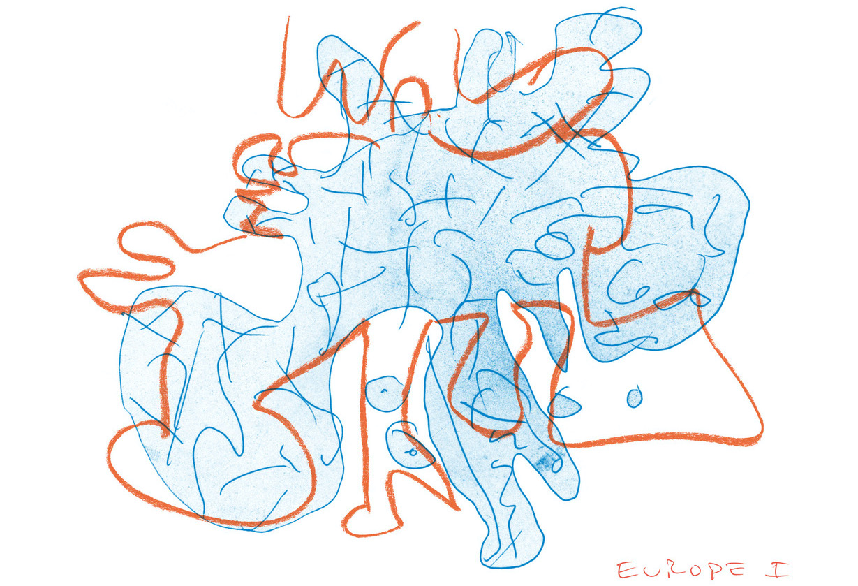
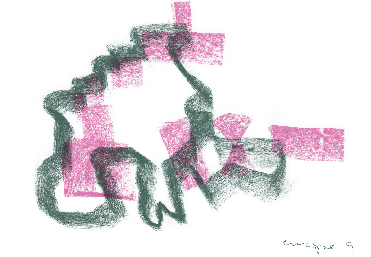
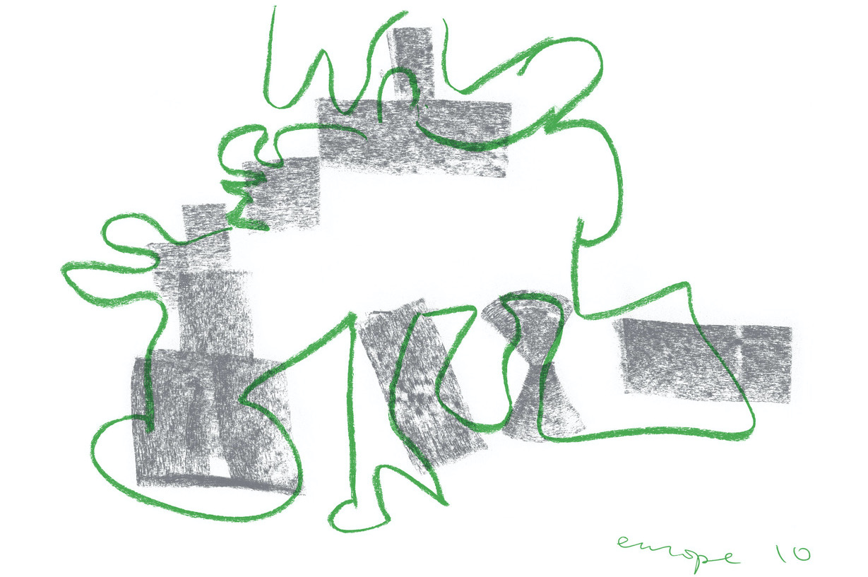
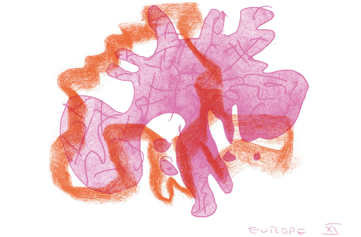
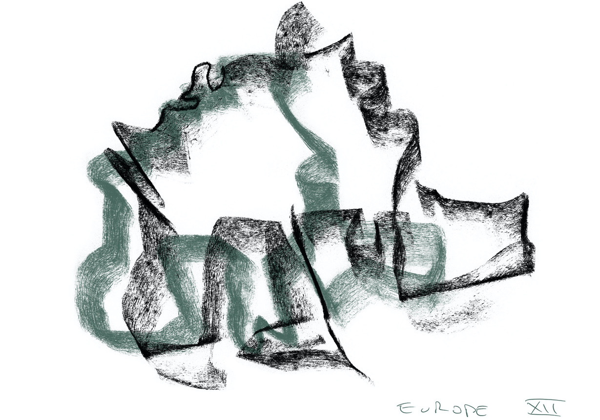
The first gesture was with a stick of charcoal, drawing a « Europe » from memory, or intuition. Thick and thin strokes of soot: a nod, intentionally or not, to the coal and steel on which the polity of modern Europe is founded. But more mystical, too. These drawings represent, in the epigrammatic words of the ERB’s print designer Patrick Doan, « the conviction that simple tools can grant us the power to face the god of paper. »
The European Review of Books is, of course, an impossible project. And a necessarily incoherent one. The title alone will spark different sentiments — aspiration, nostalgia, bitterness, scorn, confusion, delight — depending on who or where you are. It does not — cannot — have a coherent ideology. But it can have — must have — convictions and commitments. Those various convictions and commitments will surely clash; our job, then, is to give those clashes lively and lovely form.
We have our antipathies, too. For instance, the « opinion » piece bores us, as a genre — even when it’s an opinion we agree with. The « European » intellectual atmosphere is already saturated with opinion, after all, with platitude and brow-furrowed sanctimony. To be committed to the essay is to be committed to the open form, and to cultivating the writers who will flourish in it.
All maps are figurative, even those fanciful maps that are the same size as the territory being mapped. Lewis Carroll conjured such a map in the novel Silvie and Bruno Concluded (1893): a German-accented absurdity named only « Mein Herr » describes « a map of the country, on the scale of a mile to the mile! » — only to admit that it « has never been spread out, » because it would « shut out the sunlight » and farmers would object. « So we now use the country itself, as its own map, and I assure you it does nearly as well. » Jorge Luis Borges, a master of deadpan hilarity, took up the conceit in 1946, in « Del rigor en la ciencia » (« On Rigor in Science »), a one-paragraph short story about « a Map of the Empire whose size was that of the Empire, and which coincided point for point with it. » The pinnacle of cartography is the pinnacle of uselessness.
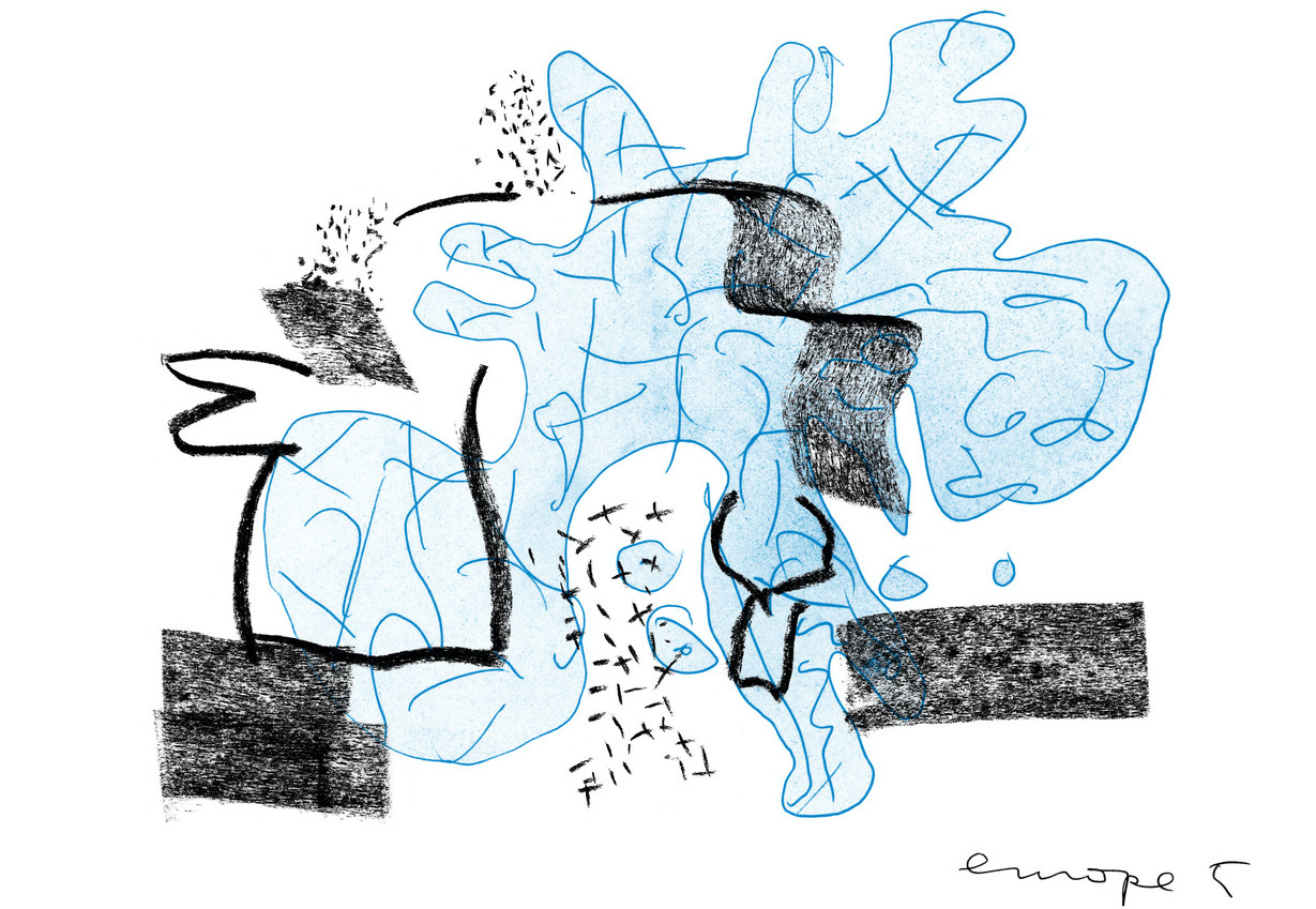
Probably it is tempting to decode these maps, to peer into them for an argument. The British Isles are not included, it would seem, though maybe they should be. The eastern edges are hard to pin down. Does the odd bulbousness of the Iberian peninsula mean anything? And what the hell happened to Scandinavia?
National boundaries, it would seem, hold very little meaning at all. The squiggles hint at other political geographies, from the deeper past or some unimaginable future. A linguistic map of Europe, meanwhile, might look more like one of these than it would resemble a map of political borders.
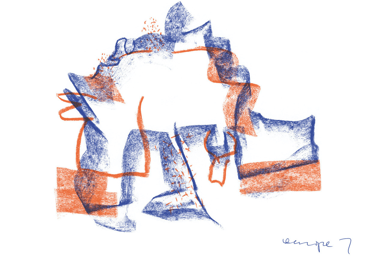
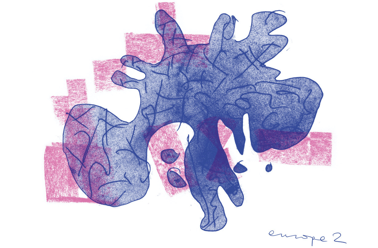
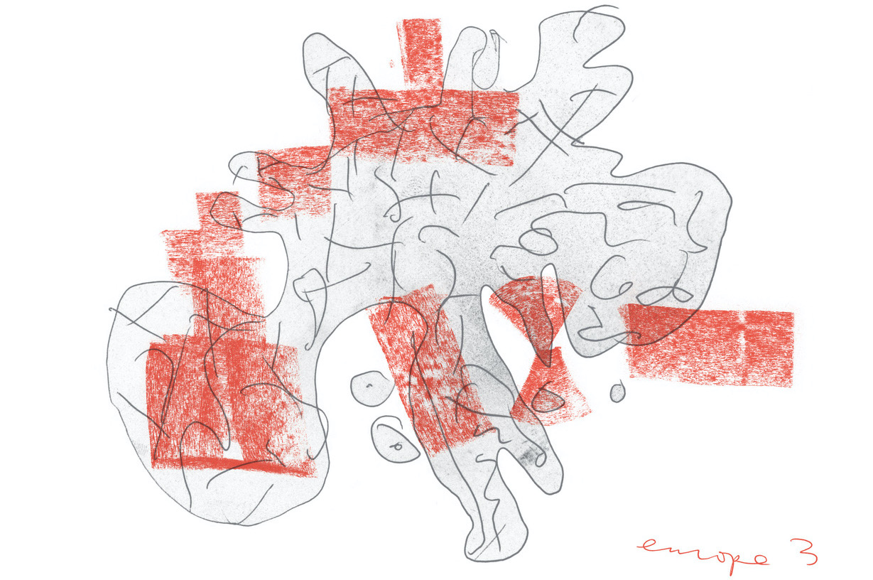
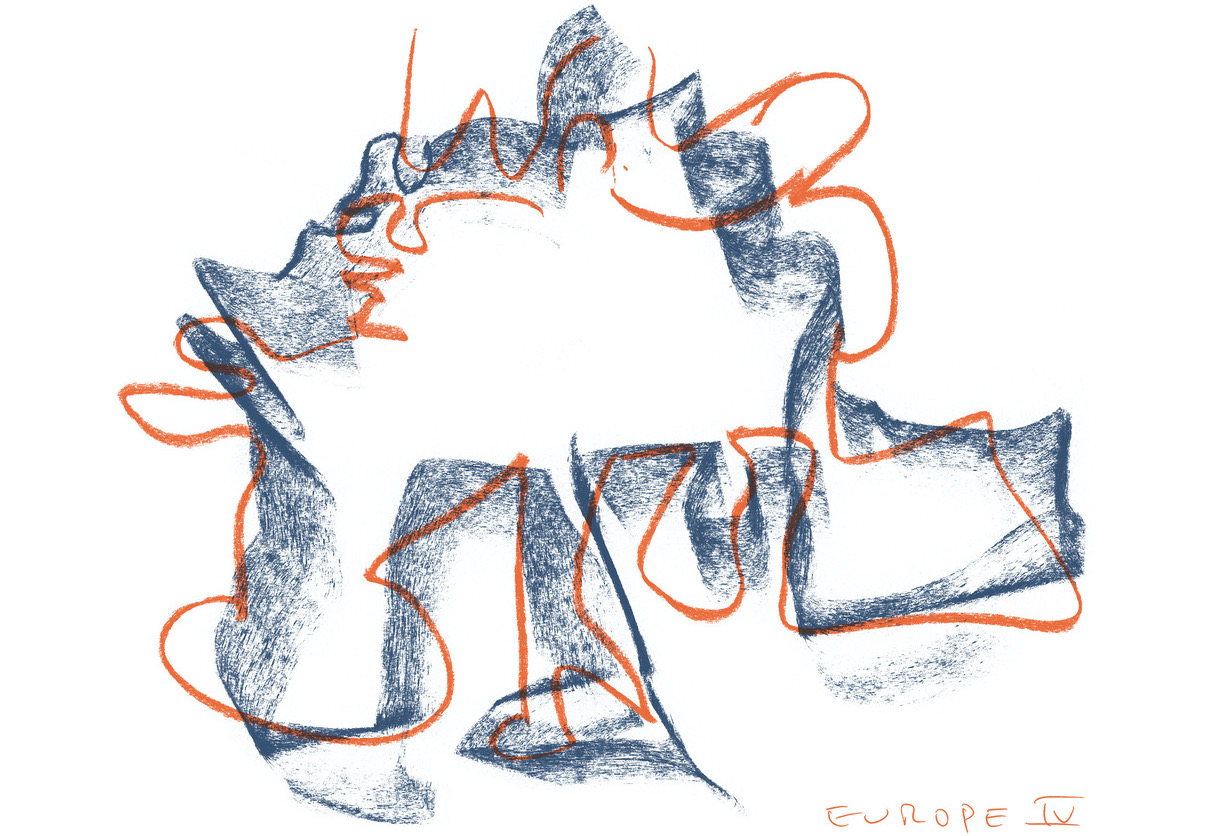
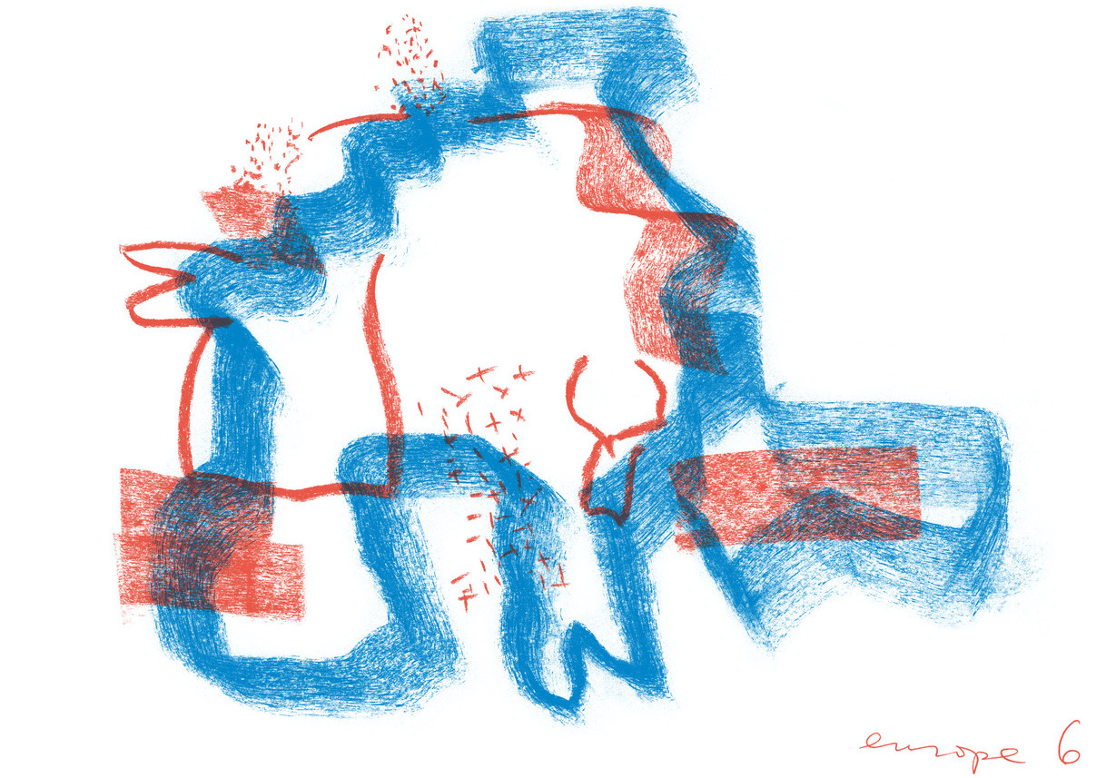
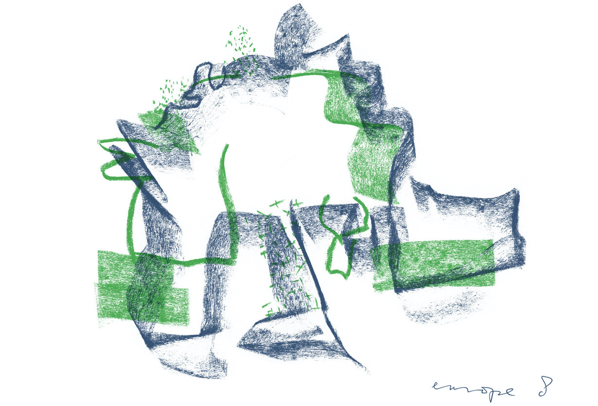
There are twelve of them. Is that a reference to the twelve stars on the official European flag? In 2004, AMO, the research arm of Koolhaas’s Office of Metropolitan Architecture (OMA), undertook to furnish a new iconography for the European Union, to replace the EU’s « mute, limp, anti-modern and ineffective » visual language. Perhaps an « iconographic deficit », was partially to blame, they suggested, for the EU’s non-resonance with the general public. So they proposed a new flag: not the staid ring of predictable stars, but a flashy barcode, its colors distilled from the flags of the member states.
It was never adopted, but a barcode-flag represents an intriguing aspiration: bright colors added to a modular, expandable, rational, scannable template. Could one pledge allegiance to it? To look at it now is to behold the relic of an untested political fantasy. It has accrued a poignant irony: less a flag than a parodic anti-flag, a symbol that deflates more allegiance than it stirs, but that charms while doing so. That too can be salutary.
Maps are representations, not metonyms. They exist to orient or disorient you. These maps, we might suggest, stand at a perpendicular to the barcode flag. They don’t impose an artificial order; what they represent is in constant, churning flux. Nor are they parodies, though their playfulness registers another commitment.
Hermann Rorschach developed his inkblot tests in a remote insane asylum in Herisau, Switzerland, and published them in 1921. He died a year later at the age of 37. The book — Psychodiagnostik: Methodik und Ergebnisse eines wahrnehmungsdiagnostischen Experiments — included ten panels, five of them black and white, five of them in colors that are striking even today.
I look at some of the Koolhaas maps and see a lumbering rhinoceros. Is it an allegory? Maybe we’re dealing with a reverse-Rorschach, a meta-Rorschach, in which the Europes were drawn, unconsciously, to look like Rorschach tests. Is that the allegory?
« There is no such thing as an empty space on a map, » the map historian J.B. Harley wrote in 1988. Leave aside the promise that an inkblot channels the unconscious, and observe that every map has its own unconscious. Harley mined the « cartographic unconscious » for the things repressed, occluded, placed on the periphery. Sea-monsters, terra incognita, colonies and conquests. Maps, like minds, always project, and in the history of European cartography one sees the workings of an imperial imagination.
Koolhaas’s maps are documents of a weirder present, occupying a plane of zany abstraction. They project — or better yet splatter — Europe onto a different sort of wall. Maybe they aspire to be maps without a Volk. Or they pin Europes to a board through the thorax, like exotic insects, to be inspected from without as well as from within.
The European Review of Books is, at the moment, nascent. Provisional. There are a lot of things that we don’t know. What will the multilingual design of the fully-realized ERB look like? Some digital interfaces are now so common, so taken for granted, that we can revel in breaking from them. Think of the standard toggling between languages on commercial websites, for instance. Or the experience of landing on some enormously-trafficked website and having it load, for some reason, in another language. Users are accustomed both to the dismal ideal of efficiency and to the reality of its clunkiness and imperfection. Some things are, for better or worse, intuitive. We know to look for the EN/NL, EN/DE, EN/FR, etc., to switch languages the same way we might switch currencies. There’s little joy in it.
So we see possibility in these maps, color laid over color the way we might lay language over language. Buried languages, mumbled languages, dreamed languages. The point is not to force an artificial congruence. A vivid incongruency is just as good.
The permanence of print — another of our commitments — can inspire a certain mysticism. The maps will be printed with soy ink on archival paper using Risography, a technology pioneered in Japan in the late 1970s and released in 1980. « Noboru Hayama’s motorized stencil machines are beasts of the east, » Patrick tells us. To print the maps on such a machine « is an act of faith that defies every rule of obsolescence programmée » — no obscolescence, planned or otherwise, for the European Review of Books! « Do not laugh when we say that the stencil screens are made out of banana fibres, » he warns, for « the result is deep. » Risography’s « fat soy ink melanges » deliver a vividness unmatched by the « superficially fused toner and anaemic ink cartridges » with which « mortals vainly try to reproduce reality. » Patrick saw in Rem’s charcoal a simple tool that can face « the god of paper. » But his description of Risography inverts the logic of divinity: « the RISO god infuses graphic life into paper at every rotation of its drums. Let the ink flow! »
Rem Koolhaas and Patrick Doan, 12 Europes, 2021